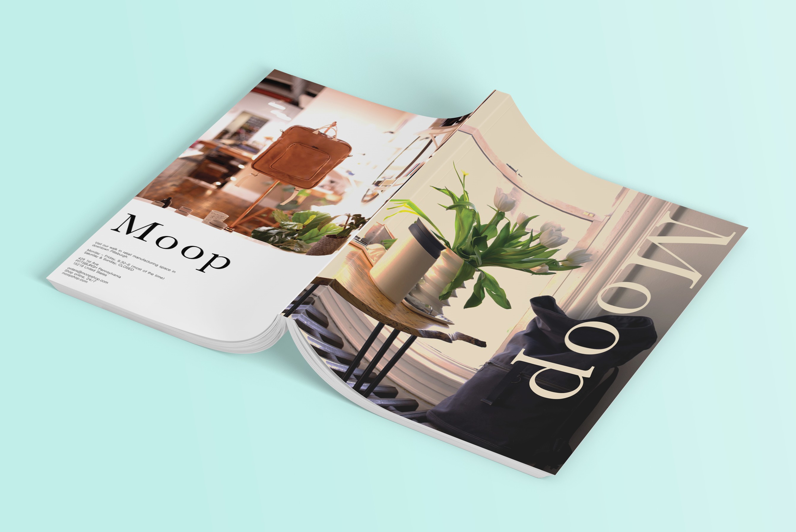
Moop
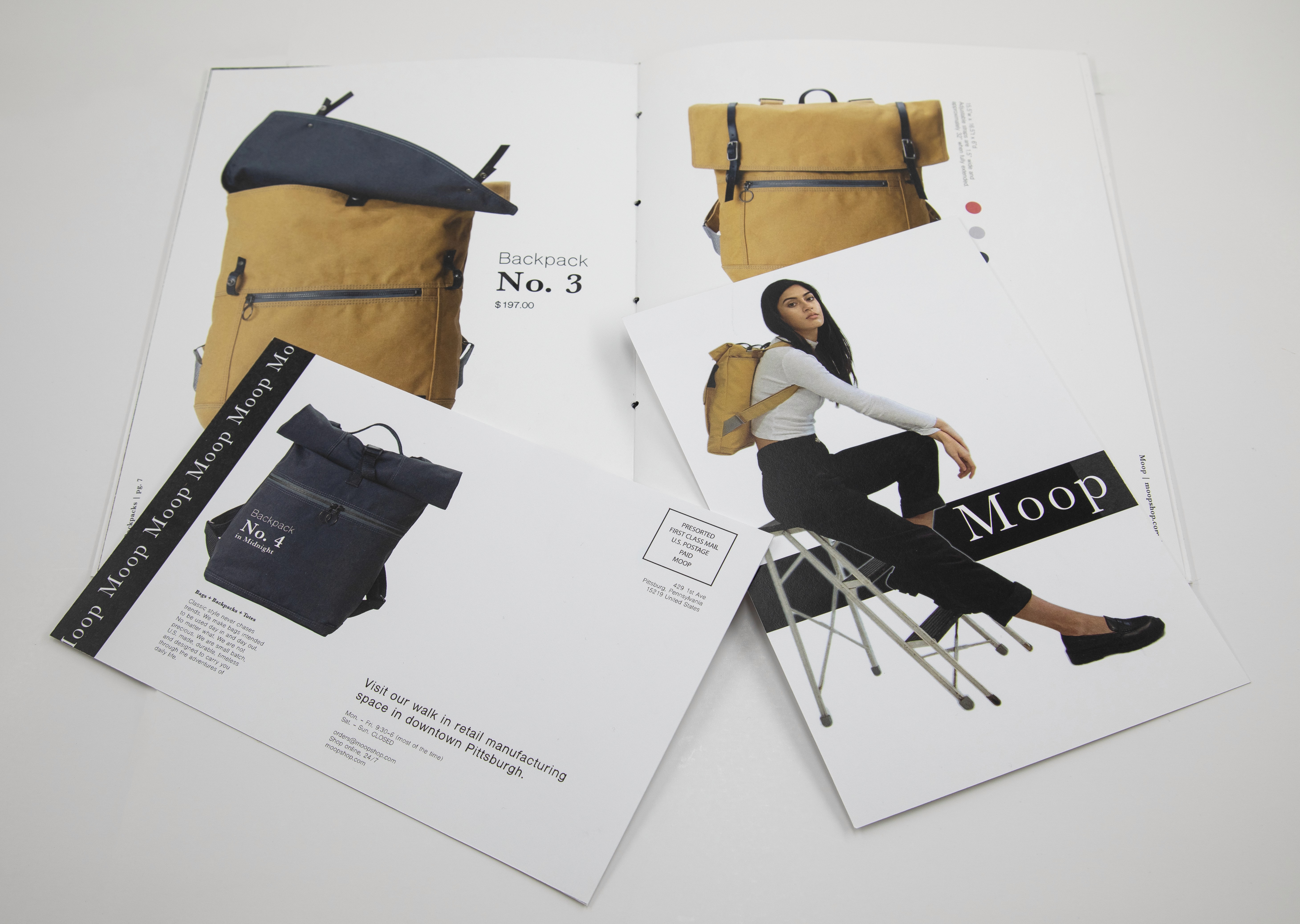
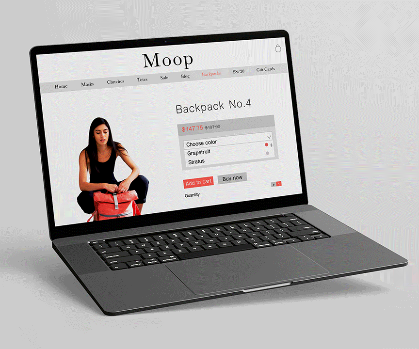
I created this product catalog/care guide as the primary deliverable, as well as a postcard, website, and style guide.

Project Overview
Client: Moop (Typography Class)
Industry: Retail
Timeline: 2 weeks (2020)
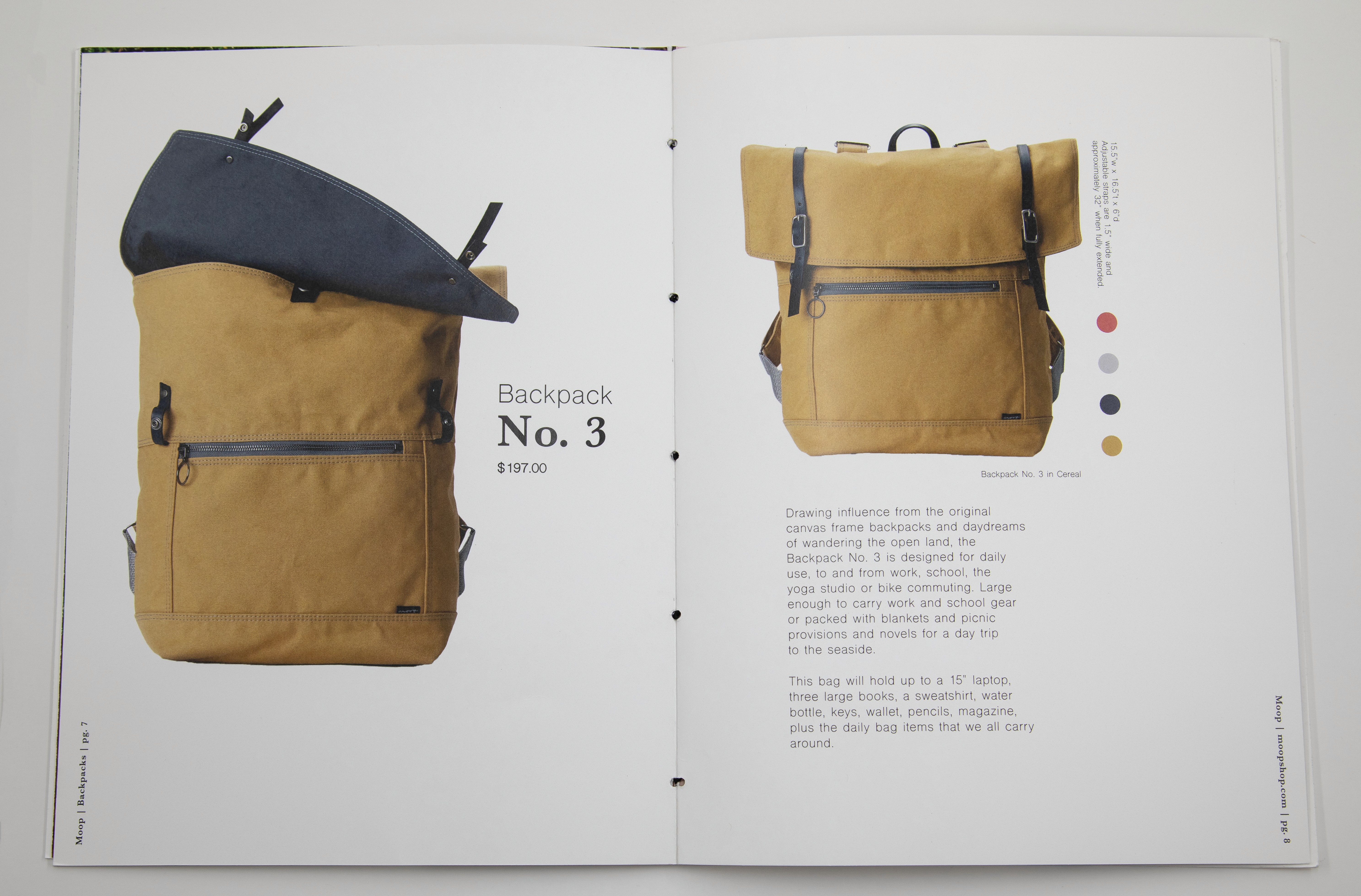
The objective of this project was to rebrand Moop, a handmade leather bag company in Seattle, Washington, focusing on typography and striking imagery to create a clear hierarchy amid the heavy text.
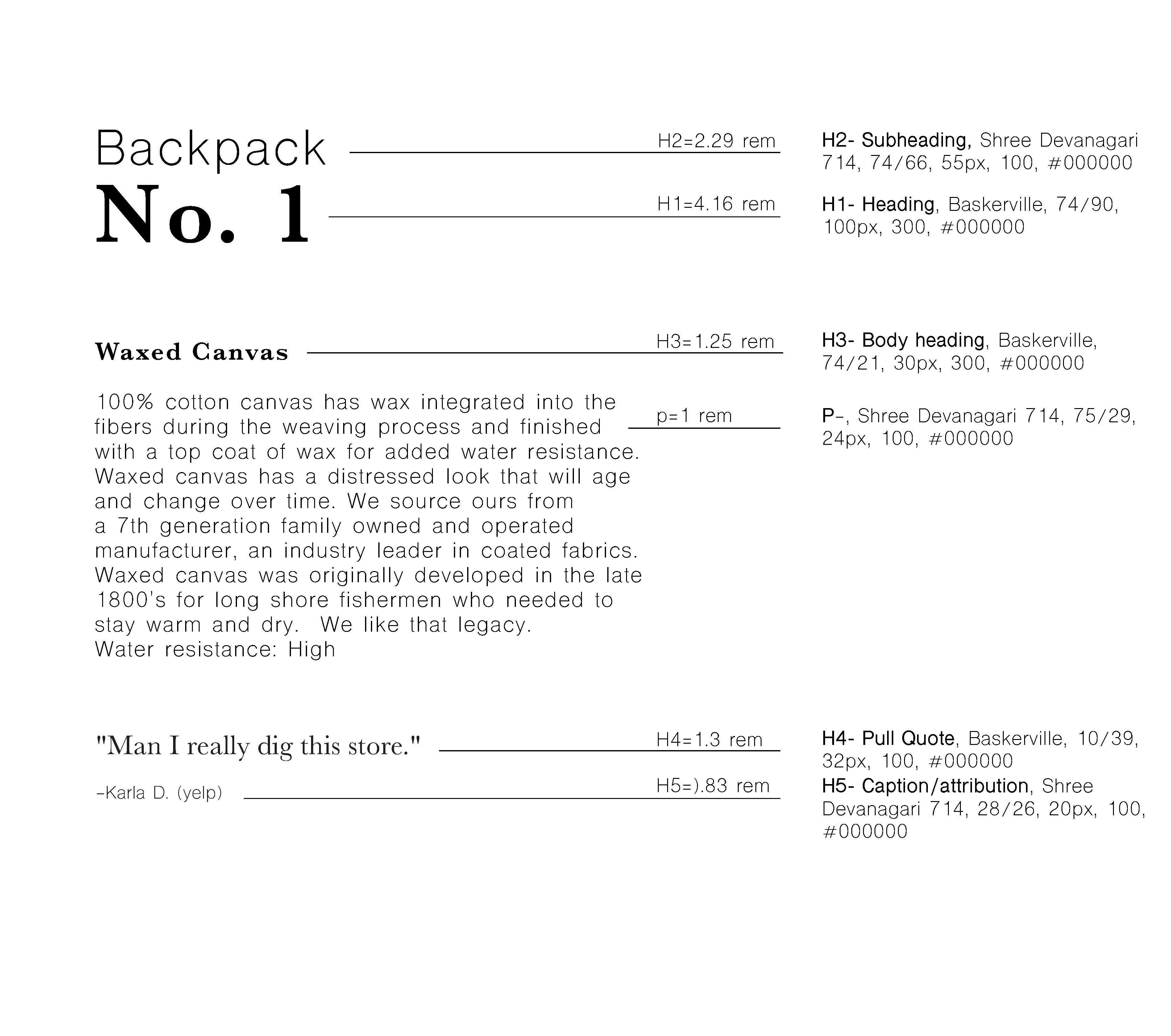
I tried to modernize Baskerville by combining two strikingly different typefaces with a strict grid throughout the catalog, and by using dramatic scale differences to create a sense of hierarchy.
You can find a PDF of this catalog to view at your leisure here.
Design Solution